Eng · ·

Multimodal features

1. Use of an IMRD format, with abstract, introduction, research method, subjects, procedure, results, and conclusion as subheadings at the beginning of each part.
Function: To allow the audience to understand the content of the poster in accordance to the structure of a research paper.

2. Avoid complex and lengthy sentence (Swales & Feak, 2000)
Function: Short sentences can ensure that the poster can be easily comprehended by the audience in a short period of time.

3. Use of chunked texts, point-forms and text boxes
Function: To promote the readability of posters and avoid redundancy.
Example:


(Dibusso & McCunney, 2007, as cited in D’Angelo 2011)
Figure 1. The use of chunked text and bullet points throughout a poster.


4. Use of fonts in different styles, including type, colour and size (Kress & van Leeuwen, 2006)
Function: To highlight the relationships between different items./To direct the audience’s attention to particular items.
Examples:


(D’Angelo, 2011)
Figure 2. The use of red, green and yellow to indicate the meaning of the arrows.


(Li, 2014)
Figure 3. The use of blue colour, italics, bolding and underlining.


5. Use of graphs, maps, taxonomies, charts, networks and tables
Function: To present the theories, data and/or analysis in a simplified way and increase the apparent professionalism (Dimopoulos et al., 2003)
Example:


(D’Angelo, 2011)
Figure 4. Research results presented in the form of a network


6. Use of large and colorful images (Wittich & Schuller, 1973)
Function: To provide a strong visual stimulation/To make the poster more outstanding from the others.
Example:


(Penland, 2006, as cited in D’Angelo, 2011)
Figure 5. A large photo showing two lawyers in the middle of the poster.


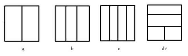
7. Use of vertical columns
Function: To guide the audience to read the poster in a designated order
Example:


(Tonkyn, 2008, as cited in D’Angelo, 2010)
Figure 6. The organization of the content in three columns


8. Use of frame lines (e.g. lines, bars, shapes)
Function 1: To elevate the readability of a poster
Function 2: To group similar items in the same sections and highlight their consistency and unity regarding the same topics.
Examples:


(Morales, Shehu, & Liriano, n.d.)
Figure 7. Physical frame lines drawn for each section


(DeWitt, n.d.)
Figure 8. The use of different colours for compartmentalization


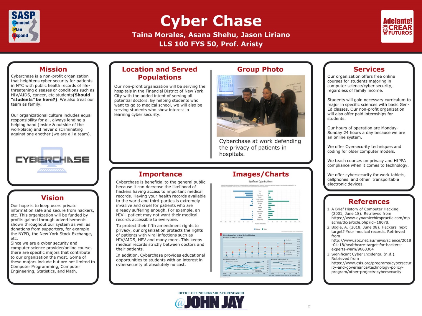
9. Use of frame markers such as numbers/letters before subheadings
Function: To illustrate the order of the texts, highlight the purpose of research, label different phrases and open a new topic (Hyland, 2005)
Example:


(Pardo-Álvarez et al., 2018)
Figure 9. Every sub-heading is numbered.


10. Displaying the content in left-right, triptych, quadriptych, top-down arrangement
Function: To match with the traditional way of reading English texts from left to right and top to bottom and help the audience to read in an order which helps the audience to clearly see the logical connections among sections./To show different importance of information. Middle information is usually more important than peripheral ones.
Example:


(Li, 2014)
Figure 10. Some common layouts of posters


11. Use of vectors
Function: To guide the audience to read the poster according to a particular order.
Example


(Li, 2014)
Figure 11. Drawing arrows on the poster.


12. Use of consistent colors and shapes
Function: To emphasize the coherence of the poster
Example:


(Tal & Wansink, 2015)
Figure 12. Units of the same colour are arranged on the same green background


References
Alley, M. (2003). The craft of scientific presentations: Critical steps to succeed and critical errors to avoid. New York, NY: Springer New York.
D’Angelo, L. (2010). Creating a framework for the analysis of academic posters. Language Studies Working Papers, 2, 38-50.
D’Angelo, L. (2011). Academic posters across disciplines: A preliminary study. Language studies working papers, 3, 15-28.
DeWitt, J. (n.d.). Developing a peer mentoring program for the UC Davis University Honors Program. Retrieved from https://urc.ucdavis.edu/photo-galleries/uc-davis-academic-posters#&gid=1&pid=5.
Dimopoulos, K., Koulaidis, V., & Sklaveniti, S. (2003). Towards an analysis of visual images in school science textbooks and press articles about science and technology. Research in Science Education, 33(2), 189-216.
Hyland, K. (2005). Metadiscourse: Exploring writing in interaction. London: Continuum, 13-15.
Kress, G., & van Leeuwen, T. (1998). Multimodal discourse: The modes and media of contemporary communication. London: Arnold.
Li, Y. (2014). Multimodal analysis of academic posters by student writers across disciplines. HKU Theses Online (HKUTO).
Morales, T. Shehu, A. & Liriano, J. (n.d.). Cyber chase. Retrieved from http://www.jjay.cuny.edu/sites/default/files/contentgroups/sasp/poster_gallery/2018/adelante_aristy01.jpg.
Pardo-Álvarez, Á., Fleckenstein, J., Schilling, O. S., Trauth, N., Hunkeler, D., & Brunner, P. (2018). Closing the conceptual gap between the hyporheic zone and the river corridor. Retrieved from https://www.researchgate.net/publication/325499051_Closing_the_conceptual_gap_between_the_hyporheic_zone_and_the_river_corridor.
Swales, J., & Feak, C. (2000). English in today's research world: A writing guide (Michigan series in English for academic & professional purposes). Ann Arbor: University of Michigan Press.
Tal, A., & Wansink, B. (2015). In pieces: Food is more filling when pre-cut to several pieces. Journal of Nutrition Education and Behavior, 47(4), S41-S42.
Wittich, A.W., & Schuller, F.C. (1973). Instructional technology: Its nature and use. New York: Harper and Row.